Turning equipment data into decisions for reliability engineers
Engineers couldn't quickly see what was failing, why, or what to do next.
- ○ SUS from the low 70s to high 80s across Asset Health and Asset Details.
- ○ Took over all research after the researcher left: screeners, moderated sessions, affinity mapping, analysis.
- ○ Recreation: full platform rebuild with narrative-driven Asset Inspection, five icon systems, and WCAG 2.1 AA.
The last year I worked at Honeywell I was put on a new product introduction for what would become Honeywell APM. The legacy product was Asset Sentinel, built by engineers, heavy on data, light on usability. I was part of a team of three UX designers building for reliability and maintenance engineers at companies like Shell. The product had to consolidate fragmented workflows into one platform. I owned the two entry points: Asset Health, the first screen engineers see, and Asset Details, where they investigate a specific asset.
This case study has two parts. The first covers what I shipped at Honeywell under real constraints: stakeholder decisions I disagreed with, research I took over, and compromises I navigated. The second covers what I built after: a working React prototype that reflects my vision for what the platform should be, grounded in the same research but free from the constraints.
The problem
Reliability engineers were juggling multiple tools to understand their plant. Checking one system for sensor data, another for work orders, another for trends. Tons of tabs, no single view. APM was supposed to bring all of that into one place: see, understand, triage, and maintain, in a structured flow. My challenge was figuring out how engineers actually think through that workflow. What are they looking at first, what patterns are they making sense of, where do they dive deeper, and at what point do they decide to take action and create a work order or open a case.
The work
Three designers, no research budget. We started with desk research and independent exploration, then came together to compare.
During sessions with PMs, engineers, and subject matter experts, I kept raising questions that needed real answers. That got us approved for research. We had a researcher but they got pulled onto another project early. I took over: screeners, interview guides, moderated sessions on UserTesting, affinity mapping in Miro after each round. I ran the research and the design iterations together, testing at every major milestone. SUS went from the low 70s to the high 80s.
Testing with engineers
Usability session on UserTesting. Screeners and scripts written from scratch, findings synthesized in Miro after each round.
The risk matrix was red across the board. High, medium, low, all the same hue at different weights. Color is semantic. A low priority asset going to routine maintenance shouldn't feel like an emergency. Clicking it also filtered the data table below, but users didn't notice the table changed. A known issue from Warehouse Ops. Same pattern here.
Red means stop. Blue means routine. If the table changed, prove it.
I tested alternatives for each color. Orange for medium, carries caution without screaming. Yellow failed accessibility. Darker yellow looked like food poisoning. Blue tested well for low. People read it as calm and routine, which matched the meaning. For the interaction, pushed for a tooltip, a hover affordance, and auto-scroll to the table. Tooltip and affordance shipped. Scroll got rejected.
Red, orange, blue. Three priorities, three meanings. Two out of three interaction fixes shipped. The scroll tested better but the tradeoff was real.
Finding the patterns
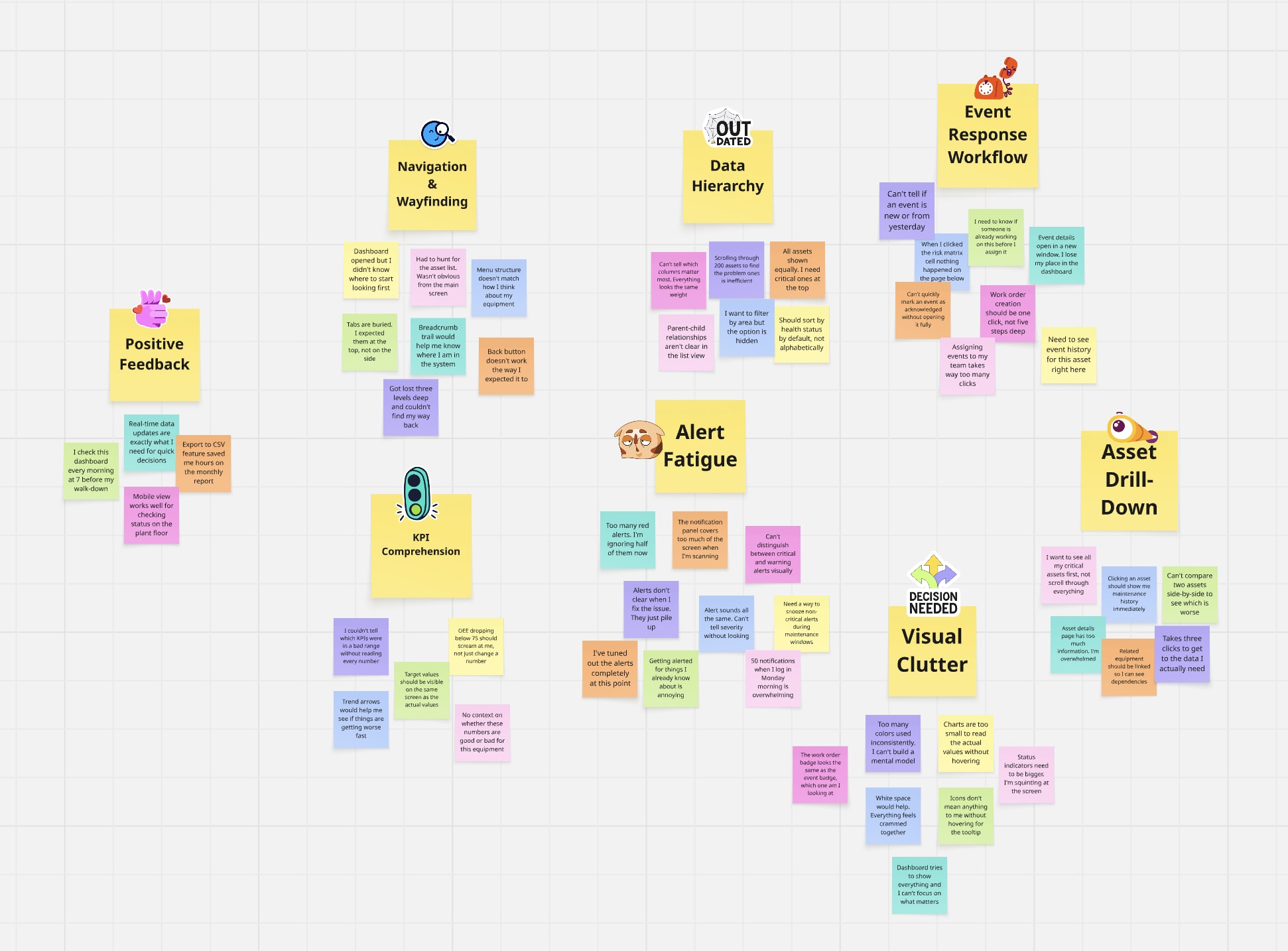
Observations from each round grouped by theme in Miro. If users kept stumbling on the same thing, that became a priority.
My research supported tabs. Users valued scanning one domain at a time without interference from the others. Stakeholders wanted everything on one page so engineers could compare across domains. I advocated for tabs with user quotes and documented findings. The decision didn't move.
They said one page. I made it work.
I redirected the design energy into a three-level modular structure: Reliability, Maintenance, and Performance as distinct visual zones on one surface. First card in each row filters the cards beside it. Run status got a full accessibility redesign: color, shape, and icon system with a legend to replace a visualization pulled from another platform.
The constraint forced a better answer. The modular structure gave engineers comparison without tabs and compartmentalization without navigation.
What I'd build
I knew what the research said. I knew what I'd do differently. I rebuilt the entire platform in React. No NDA restrictions, no stakeholder vetoes. Same research, no constraints.
How the data connects
Everything starts with a physical asset. K-101 is a centrifugal compressor classified as Safety-critical. It has sub-assets, and each sub-asset has sensors with thresholds.
When a sensor value crosses its threshold, the system creates an event. The severity is computed, not assigned -- it comes from a matrix of what happened crossed with how critical the asset is. Every event carries structured metadata: cause, consequence, and recommendation, each tracked with its source (human or system), confidence level, and confirmation status.
| A (Safety) | B (Production) | C (Support) | |
|---|---|---|---|
| trip | Critical | High | Medium |
| alarm | High | Medium | Low |
| alert | Medium | Low | Low |
The system correlates events by asset, timing, and causal chain. An engineer confirms the grouping and identifies the root cause. This turns scattered alerts into a single incident with a clear story. The dashboard surfaces that story as a three-act narrative: what triggered it, what it caused, and what confirmed it.
Events spawn work orders and investigations. Work orders fix the problem. Investigations understand it. An investigation can span multiple events and reach back into history.
All of this activity flows into the health metrics. OEE breaks down into availability, performance, and quality. MTBF, MTTR, and RUL tell the reliability story. Every number derives from the events and work orders above.
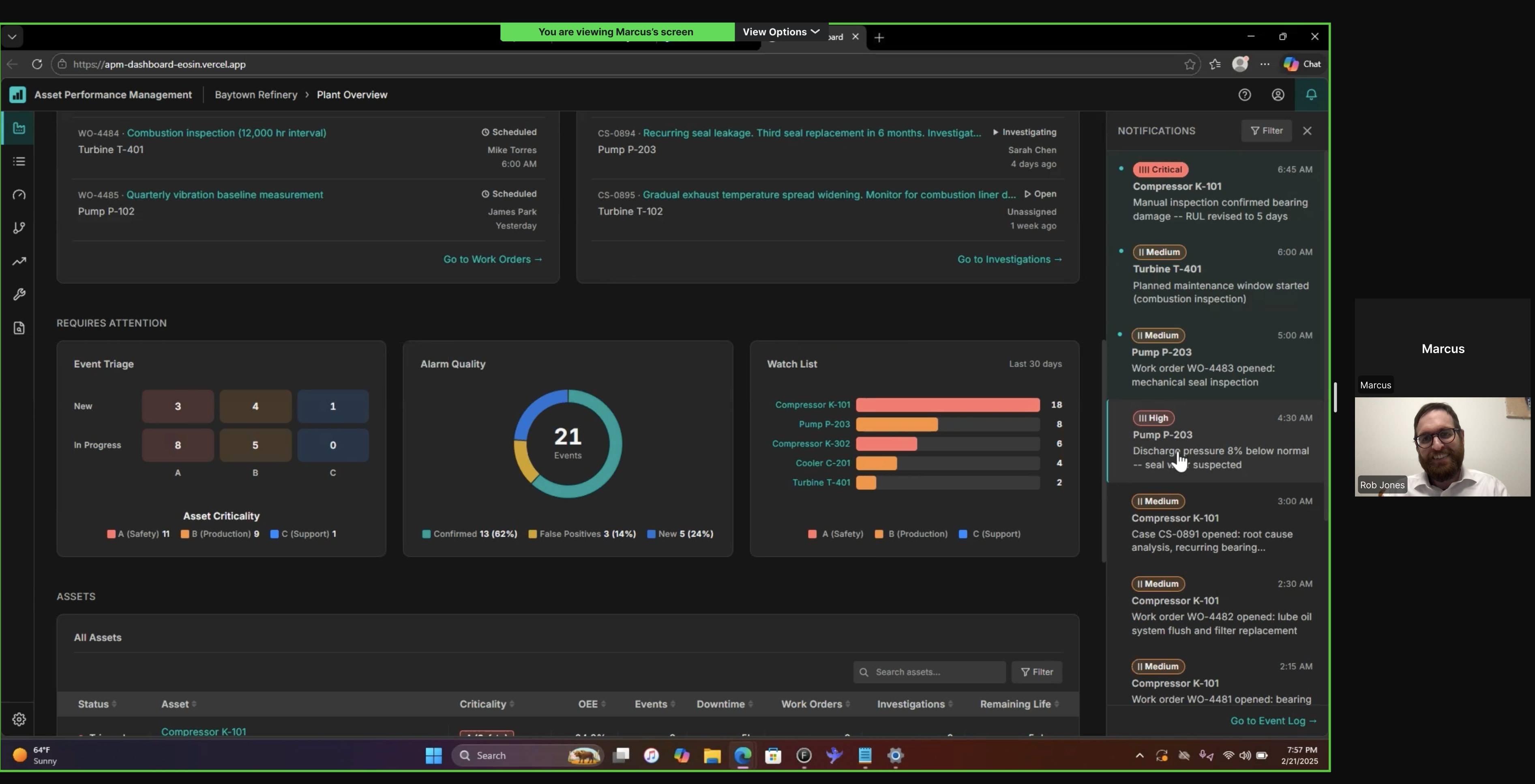
The engineer sees all of this at 7 AM, ordered by the morning triage workflow: check health, understand cause, check response, identify remaining work, then drill into specifics.
Every entity in the dashboard traces back to a physical sensor reading. This is how the data model connects. Follow K-101 from the plant floor to the engineer's morning triage.
Honeywell's Asset Health showed data but not the story behind it. Engineers had to piece together what was happening on their own.
Don't dump data. Tell the story.
Every asset has a story. Plant Overview delivers it in sequence: what happened, how bad is it, who's on it, what do I need to do, then dive deeper. Each layer answers the next question before the engineer has to ask it.
The data was always there. The problem was how it was delivered. Layered context beats a wall of metrics.
The icon system
The dashboard shows event severity, work order urgency, investigation status, asset criticality, and asset status. Early iterations used the same colored pill badges for both event severity and work order priority. Engineers scanning the Work Orders card couldn't tell whether "Critical" meant a dangerous event or an urgent repair.
Five systems, zero collisions.
Each classification system got its own shape language. Tally bars for severity. Circles for work orders. Triangles for investigations. Letter grades for criticality. Dots for status. No shared shapes, no shared color logic, readable without color alone.
If two systems look the same, the engineer has to read the label to tell them apart. Distinct shape families let them pattern-match at a glance: pill with bars means event, circle means work order, triangle means investigation.
The filter interaction
The scroll-to-table was rejected at Honeywell because it knocked users out of context. That was a valid concern. But the current state, where users don't notice the table changed, is worse.
Let the user decide.
Auto-scroll to the data table on filter click, with an onboarding marker showing where to toggle it off. Consistent filter pattern across all cards above the table, not just the risk matrix.
The constraint was real: losing context matters. The solution is user control, not removing the feature. First-time users see the connection between the filter and the table. Experienced users who want to stay in context turn it off. Both sides get what they need.
Reflection
A missed signal on a compressor can shut down a plant. Or worse. The deeper I got into this work, the more I felt the weight of every decision I put on screen. I test, ask hard questions, and decide.